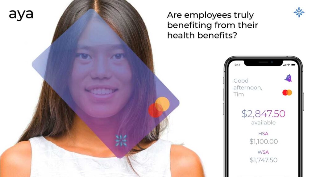
How do you make a Health Savings Account (HSA) card appeal to a generation that values aesthetics and digital-first experiences as much as financial benefits? This was the core challenge facing Aya Visa. Their product was functional, but it wasn't connecting with a younger demographic, a crucial segment for future growth. The brand needed more than a simple marketing push; it required a fundamental transformation to change perceptions.

Aya Visa recognized the need for a comprehensive rebranding journey to become more relevant and attractive. This is the story of how a strategic overhaul of their brand identity successfully positioned them as an innovator, capturing new market share and unlocking significant growth opportunities.

The Challenge: A Generational Disconnect
Financial products, especially those related to healthcare, often have a reputation for being complicated, corporate, and visually uninspired. Aya Visa's existing branding fell into this traditional mold, which created a significant barrier with younger consumers. This demographic is accustomed to sleek, intuitive, and design-forward brands in every other aspect of their lives, from banking with Chime to investing with Robinhood.
Aya Visa's product wasn't resonating because its brand image felt dated. It failed to communicate relevance, ease, and a modern sensibility. To capture the attention and loyalty of this audience, the company needed to stop looking like a conventional financial institution and start behaving like a contemporary tech brand.

The Solution: A Comprehensive Rebrand
We knew that a piecemeal approach wouldn't work. To truly shift perception, the rebrand had to be holistic, touching every single point where a customer interacts with Aya. The goal was to build a new brand from the ground up that was vibrant, modern, and trustworthy.
The comprehensive rebranding strategy included:
- Logo Refresh and Color Palette: We started by redesigning the logo into a clean, modern mark that felt both professional and approachable. This was paired with a new, dynamic color palette that moved away from stale corporate blues and greys, injecting energy and life into the brand.
- Modern Typography: We selected a new typography system that improved readability and gave the brand a fresh, contemporary voice across all communications.
- Brand Style Guide: To ensure consistency across the entire organization, we developed a comprehensive brand style guide. This document became the bible for all visual and verbal communication, defining everything from logo usage to tone of voice.
- Art-Directed Photography: We replaced generic stock imagery with custom, art-directed photography. The new photo library features authentic, diverse individuals in natural settings, reflecting the lifestyle of the target audience and making the brand more relatable.

Integrated Execution Across All Channels
A new identity is only effective if it's applied consistently. We integrated the refreshed branding across every facet of the business in a coordinated campaign:
- Website and Collateral: The website was completely redesigned to be visually engaging, intuitive, and mobile-first. All marketing collateral, from brochures to presentations, was updated to reflect the new, modern aesthetic.
- Credit Card Design: The physical card itself was redesigned. It became a statement piece—sleek, minimalist, and something a customer would be proud to have in their wallet.
- Brand Video and Advertising: We created a compelling brand video that told the new Aya story. This visual narrative was supported by a multi-channel advertising campaign, including direct mail and targeted online ads, all speaking the new visual language.
This end-to-end execution ensured that no matter where a potential customer encountered Aya Visa—whether through an Instagram ad, a piece of mail, or the company website—they received a consistent and compelling brand message.
The Results: A New Trajectory of Growth
The rebranding was a resounding success, transforming Aya Visa’s position in the market. The new identity successfully cut through the noise, capturing the attention of the desired younger demographic and repositioning the company as an innovator in the Health Spending Account category.
The positive outcomes were tangible and significant:
- Increased Market Share: The brand's newfound appeal led to a direct increase in customer acquisition and a larger share of the market.
- Revenue Growth: By attracting a new and engaged customer base, the company experienced substantial revenue growth.
- Investor Interest: The successful transformation and resulting growth made Aya Visa a highly attractive prospect for investors, opening up new opportunities for funding and expansion.
The success of the campaign highlights the power of strategic branding that aligns visuals with business objectives. Chandeep Madaan, CEO of Aya Payments, shared his perspective on the collaboration:
"These guys consistently deliver exceptional work that strikes the perfect balance between captivating visuals and crystal-clear messaging. Their professionalism and unwavering dedication to their craft result in remarkable content that leaves a lasting impression."
By understanding its audience and committing to a bold, comprehensive rebranding, Aya Visa didn't just get a new look—it charted a new course for its future. This card really did change everything.


