In the burgeoning world of CBD, green is the dominant color. From hemp leaves to earth tones, the visual language of the industry has largely been defined by its raw ingredients. But what happens when the product isn't just a supplement, but a decadent treat?
This was the question at the heart of our work with Clover CBD Caramels. They identified a significant gap in the market: a lack of premium options that reflected the indulgence of their product. They didn't want to look like a health food store item; they wanted to look like a high-end confection.
Our challenge was to break the mold. We needed to steer away from the ubiquitous "earthy" aesthetic and create a brand image that encapsulated luxury, relaxation, and pure indulgence.
The Challenge: Standing Out in a Green Sea
The CBD market is crowded. To the average consumer, shelves can look like a sea of sameness—brown paper packaging, green leaf motifs, and clinical typography. This aesthetic works well for tinctures and balms, but it often fails to communicate "delicious."
Clover CBD Caramels had a product that was undeniably premium. However, the existing visual codes of the industry weren't doing them any favors. They needed to differentiate themselves to appeal to an upscale consumer base—people who view CBD not just as a wellness routine, but as a moment of personal luxury.
We needed to shift the narrative from "natural remedy" to "sophisticated escape."
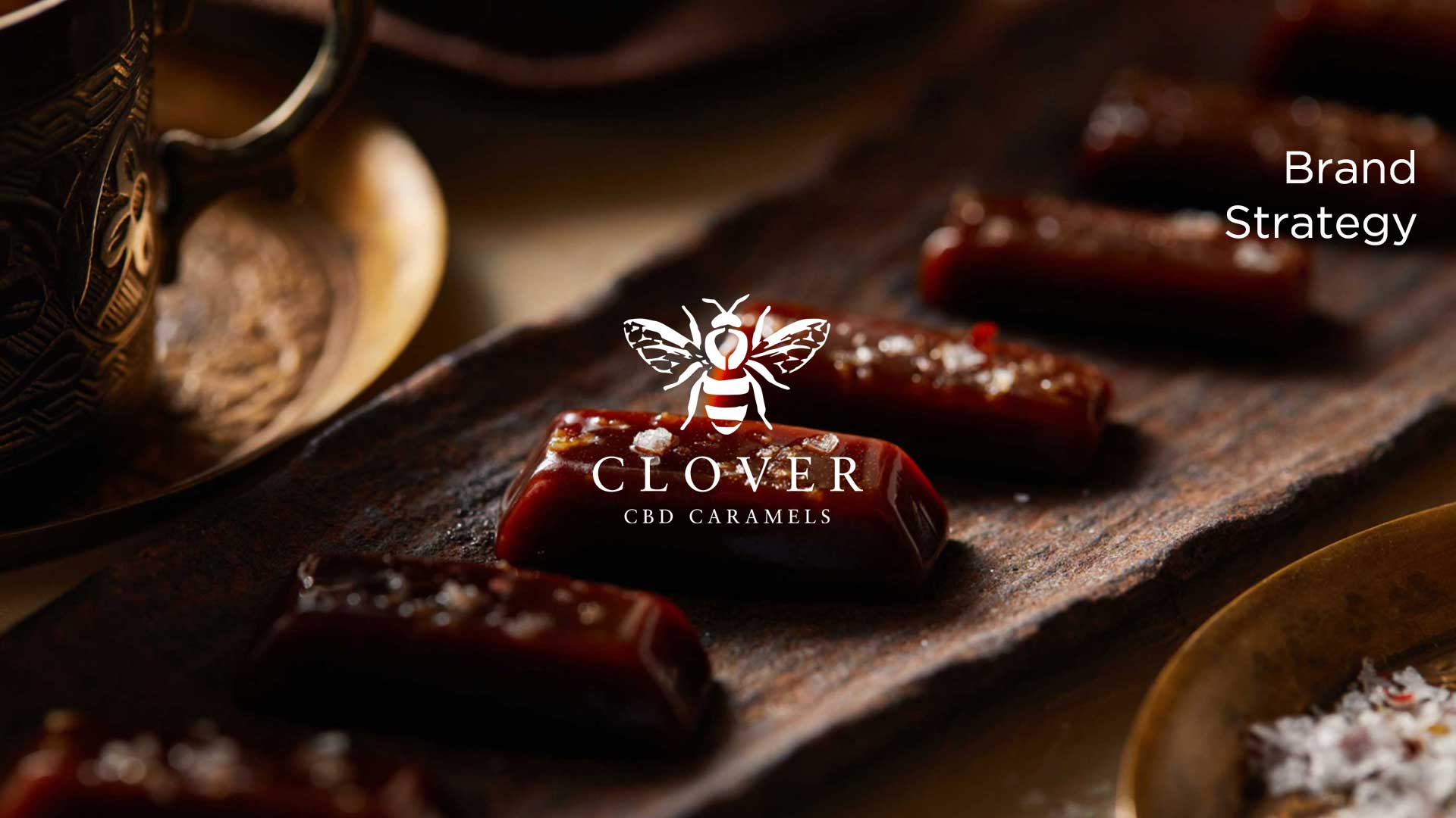
What We Did: A Taste of Luxury
To achieve this repositioning, we crafted a brand identity that exudes elegance. Every touchpoint was designed to signal quality before the customer even tasted the product.
Sleek, Modern Identity
We moved away from organic textures and embraced a clean, modern look. The logo design is refined and minimalist, avoiding the cliché cannabis imagery in favor of sophisticated typography that wouldn't look out of place in a high-end boutique. This sleek visual identity serves as a promise of the quality contained within.
Packaging as an Experience
Packaging is the first physical interaction a customer has with a brand. For Clover, we wanted that interaction to feel like opening a gift. We designed packaging that is tactile and visually striking, using premium materials and finishes. It sits on the shelf not as a supplement, but as a luxury good, inviting the consumer to treat themselves.
Elegant Photography
We staged product photography in beautiful, aspirational settings. Instead of flat lays on wooden tables, we placed the caramels in environments that evoked calm and sophistication. The lighting was warm and inviting, highlighting the rich texture of the caramel and the promise of a relaxing experience.
The Result: A Lucrative Niche
This unique branding approach successfully carved out a new niche for Clover in the CBD market. By focusing on the experience of consumption—the taste, the texture, and the feeling of relaxation—we attracted a consumer base willing to pay for premium quality.
The brand now speaks directly to those looking for a "Time to Chill" in style. It validates the idea that taking care of yourself can also be an indulgent pleasure.
The impact is best summarized by the customers themselves, who are responding to both the branding and the product quality:
"We came home from our 4 days of forest bathing in a seriously relaxed state. Plus, your caramels are addictively delicious!!"
— Susanne
By daring to look different, Clover CBD Caramels has defined what it means to relax in luxury.